26 Dec 2023
In this CSS tutorial we will create a region / box that will have animated border bottom on mouse hover. The animation will start from center and will move to left and right directions. And when the mouse hover is removed the border will shrink back to center in the same way.
You can use this technique to style your services, projects, features etc. boxes.
Create a box
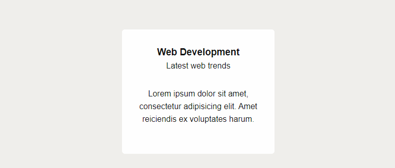
Let's first create a simple box using HTML and basic CSS.
HTML
<div class="service-box">
  <div class="service-box-content">
    <h3>Web Development</h3>
    <p>Latest web trends</p>
    <div class="service-details">
      Lorem ipsum dolor sit amet, consectetur adipisicing elit. Amet reiciendis ex voluptates harum.
    </div>
  </div>
</div>
CSS
.service-box {
  position: relative;
  display: block;
  width: 300px;
  background: #fff;
  text-align: center;
  border-radius: 6px;
  transition: all 0.4s linear;
}
.service-box-content {
  padding: 30px 30px 50px 30px;
}
.service-details {
  margin-top: 30px;
}
Add Animation Effect
Now we will add animated border bottom to this box. This box will have an animated border bottom. The animation will start from center and will move in left and right directions. And when the mouse hover is removed the border will shrink back to center in the same way.
.service-box::after {
  content: '';
  display: block;
  margin: auto;
  height: 6px;
  width: 0px;
  background: tomato;
  transition: all 0.4s linear;
}
.service-box:hover::after {
  width: 100%;
}
Full Code
<style>
.service-box {
  position: relative;
  display: block;
  width: 300px;
  background: #fff;
  text-align: center;
  border-radius: 6px;
  transition: all 0.4s linear;
}
.service-box-content {
  padding: 30px 30px 50px 30px;
}
.service-details {
  margin-top: 30px;
}
.service-box::after {
  content: '';
  display: block;
  margin: auto;
  height: 6px;
  width: 0px;
  background: tomato;
  transition: all 0.4s linear;
}
.service-box:hover::after {
  width: 100%;
}
</style>

<div class="service-box">
  <div class="service-box-content">
    <h3>Web Development</h3>
    <p>Latest web trends</p>
    <div class="service-details">
      Lorem ipsum dolor sit amet, consectetur adipisicing elit. Amet reiciendis ex voluptates harum.
    </div>
  </div>
</div>
I hope you liked this CSS tutorial.