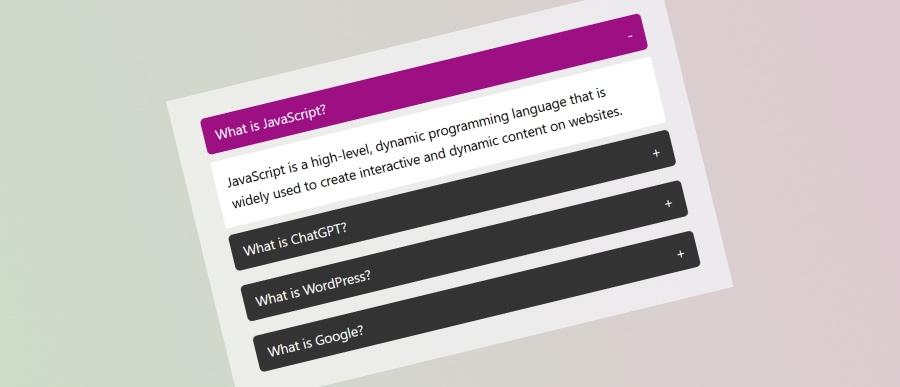
You will find accordion contents on many modern websites. An accordion is a UI pattern where content is toggled between expanded and collapsed states. This allows web developer to show more information in a small area and in a modern style. Accordions are great for enhancing the usability of your site by saving space and keeping your content organized.
In this accordion style only one item can be open at a time. This approach ensures that when you open one accordion section, any previously opened accordion section is closed automatically.
Check if this article if you want to create an accordion where multiple sections can be open at a time.
Simple Modern JavaScript Accordion
In this blog post, we will explore how to build a simple accordion using HTML, CSS, and JavaScript. Let’s dive right in!
HTML Structure
<div class="accordion-items">
  <div class="accordion-title">What is JavaScript?</div>
  <div class="accordion-body">
    <p>JavaScript is a high-level, dynamic programming language that is widely used to create interactive and dynamic content on websites.</p>
  </div>
  <div class="accordion-title">What is ChatGPT?</div>
  <div class="accordion-body">
    <p>ChatGPT is an advanced AI language model developed by OpenAI. It is based on the GPT to understand and generate human-like text.</p>
    <p>However, you can use composer to manage your website.</p>
  </div>
  <div class="accordion-title">What is WordPress?</div>
  <div class="accordion-body">
    <p>WordPress is a popular open-source content management system (CMS) used to create, manage, and publish websites.</p>
  </div>
  <div class="accordion-title">What is Google?</div>
  <div class="accordion-body">
    <p>Google is a global technology company best known for its search engine, which is one of the most widely used tools for finding information on the internet.</p>
  </div>
</div><!--/accordion-items-->
CSS for Styling
Let’s add some simple styles to make the accordion look good and ensure it behaves correctly.
/* accordion */
.accordion-items {
  display: flex;
  flex-direction: column;
  gap: 10px;
}
.accordion-title {
  position: relative;
  background-color: #333333;
  color: #ffffff;
  padding: 10px 16px;
  border-radius: 6px;
  cursor: pointer;
  transition: background-color 0.3s linear;
}
.accordion-title::after {
  position: absolute;
  content: "+";
  right: 16px;
}
.accordion-body {
  background-color: #ffffff;
  padding: 0 16px;
  height: 0px;
  overflow: hidden;
  transition: all 0.3s linear;
}
.accordion-body p:last-of-type {
  margin: 0;
}
.accordion-active {
  background-color: #9d0f83;
}
.accordion-active::after {
  content: "-";
}
.accordion-active + .accordion-body {
  height: unset;
  padding: 16px;
}
JavaScript for Accordion Functionality
We will use JavaScript to accordion the content sections when the user clicks the accordion title.
Here’s the JavaScript code:
const accItem = document.getElementsByClassName('accordion-title');
let i;
let last;
for (i = 0; i < accItem.length; i++) {
  accItem[i].addEventListener("click", function(){
    if(last) {
      last.classList.toggle("accordion-active",false);
    }
    this.classList.toggle("accordion-active");
    last = this;
  });
}
In this tutorial, we have built a simple accordion component from scratch using HTML, CSS, and JavaScript. The accordion we created allows users to expand and collapse sections of content by clicking the title of section. And only one accordion item is open at a time.
Feel free to modify this accordion with additional features, such as color, animations, icons. Happy coding!
